Project Details
Website: transformationreiki.com
Project Overview
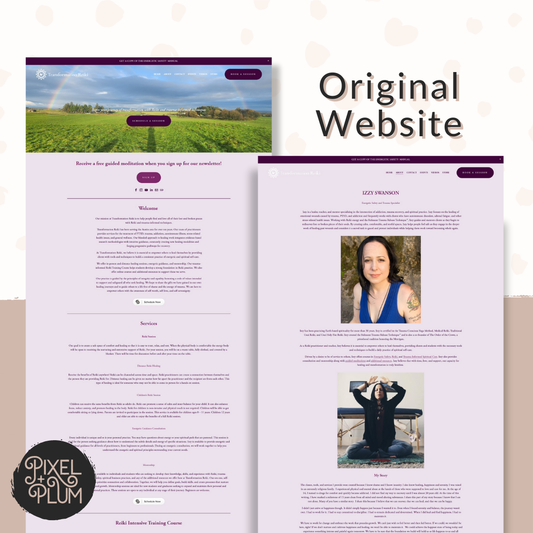
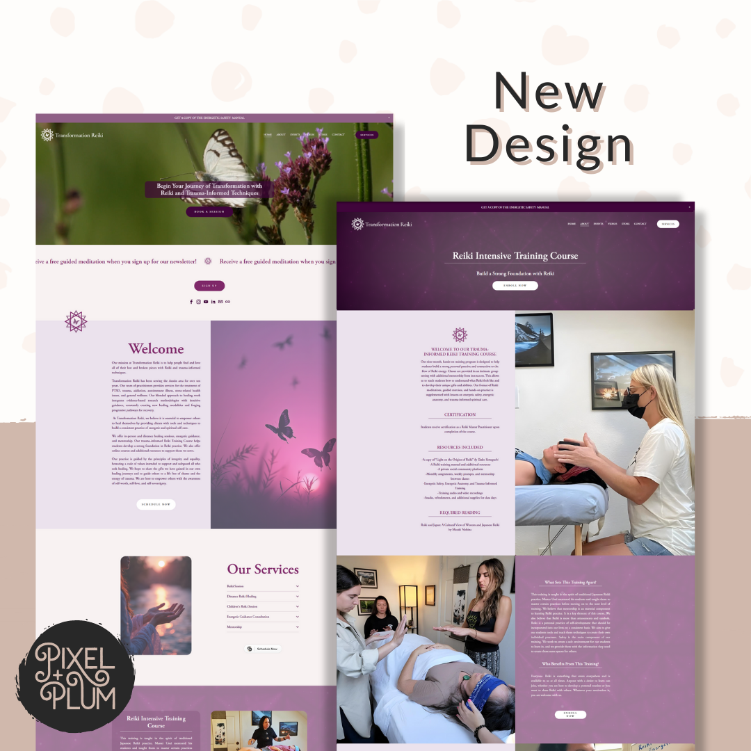
Transformation Reiki, a trauma-informed Reiki practice offering healing sessions and practitioner training, sought a website redesign to modernize its platform, improve user experience, and create a more cohesive brand presence. The original website, built on Squarespace 7.0, was outdated and lacked the intuitive navigation and aesthetic alignment that the brand needed. With growing traffic and a desire to better serve both clients and trainees, the business owner sought a strategic redesign that reflected the brand’s values while providing a seamless experience for visitors..
Objectives
The primary goals for this project were:
- Upgrading the website from Squarespace 7.0 to 7.1 for better performance and features.
- Creating a more intuitive and user-friendly navigation structure.
- Ensuring the website visually aligned with Transformation Reiki’s brand identity.
- Maintaining key functionalities, including session booking, informational pages, and practitioner training resources.
- Providing the client with tools and knowledge to independently manage and update the website moving forward.
Brand Values
Transformation Reiki is built on a foundation of:
- Healing: Providing energy work to help clients process trauma and restore balance.
- Empowerment: Equipping clients and practitioners with knowledge and tools to navigate their own healing journeys.
- Spirituality: Honoring the energetic and intuitive nature of Reiki as a practice.
- Trauma-Informed Care: Ensuring safe, supportive experiences for all clients.
These values were at the core of the design strategy, influencing everything from the color palette to the site’s structure and content flow.
Design Style
The updated design focused on creating a space that was both calming and energizing, striking a balance between serenity and vibrancy. The following elements were key:
- Color Psychology: Various shades of purple were used throughout the website to reinforce spirituality, intuition, and transformation. Purple is often associated with higher consciousness and healing, making it the ideal choice for a Reiki-based brand.
- Logo Refinement: The existing logo was updated with new typography and vectorized, ensuring high-quality scalability for future use across different mediums.
- User-Friendly Layout: A streamlined navigation structure made it easier for visitors to book sessions, learn about Reiki training, and explore resources.
- Imagery & Visual Flow: The website integrated professional imagery and soft, organic and geometric design elements to maintain a cohesive and inviting aesthetic.
Target Audience
Transformation Reiki serves a diverse clientele, including:
- Individuals seeking energetic healing, particularly those recovering from trauma.
- Aspiring and experienced Reiki practitioners looking to deepen their practice through training and mentorship.
Outcome
The final website successfully addressed the client’s needs and exceeded expectations by:
- Enhancing Brand Alignment: The design now accurately reflects Transformation Reiki’s identity, reinforcing trust and credibility.
- Improving User Experience: The new layout is more intuitive and visually appealing, making it easier for visitors to navigate.
- Providing Long-Term Usability: The client was equipped with tools and guidance to maintain and update the site independently, ensuring continued consistency and brand integrity.
Overall, the project transformed Transformation Reiki’s digital presence into a polished, professional, and functional website that effectively serves both clients and practitioners.
Coming Soon
- Izzy Swanson, Owner/Practitioner
